
|
 | |  | |
 | | - TACT GRAPH - DOCUMENTATION |

<- TACT Graph
GETTING STARTED
Once TACTGRAPH is installed, the Graphing option will either appear on the appropriate screen menu or you will be prompted after viewing or printing a report that can also be graphed.
TACTGRAPH OPTIONS
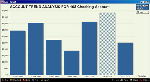
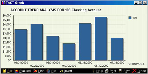
When the cursor is hovered over any point on the graph, the value of that bar or point will be shown in the upper right hand corner of the screen and the bar will change appearance. In the example above, the cursor was hovering over the 6/30/2000 bar and its actual value of $5,804 appears in the upper right corner.
The default for most graphs is Bar. Once the graph appears, you can choose to view the graph as a Stacked Bar, Line or Pie Chart.
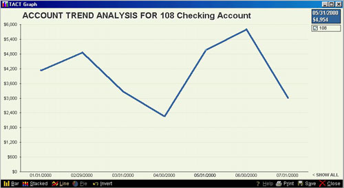
A line chart may be shown simply by clicking on LINE or using Ctrl-L.
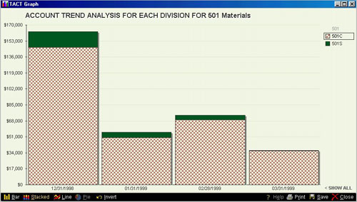
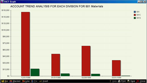
A Stacked Bar chart is basically the same as a pie chart and works well when you have multiple values that add up to a whole. In this example, you can see how 501C and 501S make up the whole of account 501.
Note that when the cursor hovers over an item on the legend on the left, all matching amounts in the bars are highlighted.
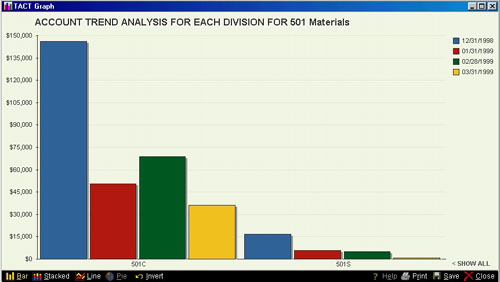
You can switch the X and Y values on a graph by choosing Invert. In this example, the GL numbers are now on the bottom legend and the Posting Dates are on the right. Now you can see the trend for each GL over time.
CUSTOMIZING THE GRAPHS
Once the graph is displayed, you can decide to eliminate any value from the graph. In the example above, there were initially 3 values, 501, 501C and 501S. By eliminating 501 (which was only a Subaccount and had no values), you can now see just the information you want. You can eliminate any values from either the bottom or right hand legend to customize your graph.
Click on the SHOW ALL to put all the values back into the graph display.
CLOSING THE GRAPH WINDOW
To close the graph window, you can press ESC, click on the X in the upper right corner or chose Close in the lower right corner of the graph window.
SAVING TACTGRAPH SCREENS
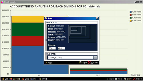
The graph is displayed in a separate window from TACT. You can size the window to anything you like before you save it.
When you choose Save, the default is to save the graph as the size of the window it is in. You can also choose other sizes. It is best to choose a size close to the one you may wish to import into a document since that will give you the clearest print. Sizing the window in Word after importing it could diminish the clarity of the graph.
Enter the name in the FILE NAME box to save this graph for importing into other programs such as Word. Then click Save to complete saving the graph.
PRINTING TACTGRAPH SCREENS
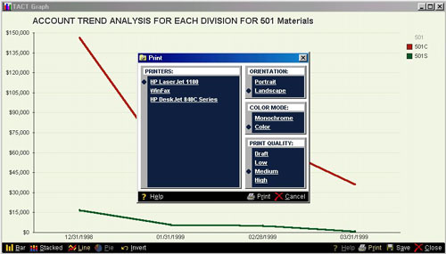
The graph can be printed to any Windows printer you have connected. The list of printers you have set up will appear in the Print window. Select the printer, the direction of the print (Portrait or Landscape), Monochrome or Color mode and the Print Quality, then click on Print.
Printing directly from TACT Graph will print a full page of the graph. If you want to print a different size graph, save it and import it into Word to print it.
USING TACTGRAPH WITH GL ACCOUNTS
There are many different ways you can graph information from your Chart of Accounts.
GRAPHING A SINGLE ACCOUNT
Choose the account you wish to graph through Add/Change/Del Chart of Accounts. You will have G-Graph as a menu selection when looking at that GL account.
When you select G, you will be given several options depending on the type of account you have chosen to graph.
GRAPHING ASSET, LIABILITY OR CAPITAL ACCOUNTS
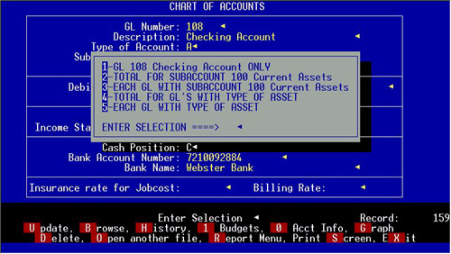
You have the choice of graphing just this account, just this Subaccount, each GL within the Subaccount, total for the Type of Account or each GL in the Type of Account.
Note: There is a limit to the number of entries that you would want on a graph at one time so if you have more than 20 accounts in the Subaccount or Type of Account, you may not want to try to graph that option.
Once you have chosen which graph you want, you will be prompted for a range of dates for the graph. The default is the last 12 posted months. You can only graph permanently posted data.
1-GL Account ONLY
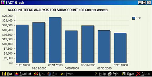
2-Total for Subaccount
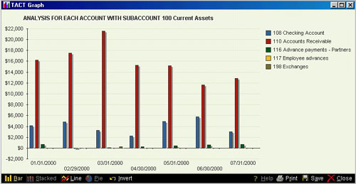
3-Each GL with the same Subaccount
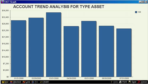
4-Total of all GL’s with the same Type
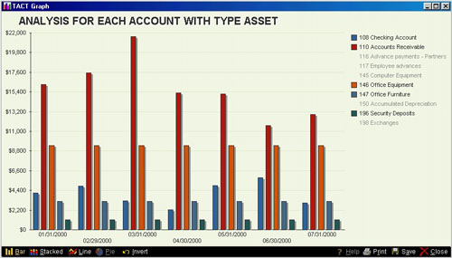
5-Each GL with the same Type
Notice how you can selectively remove any GL from the display if you want to see only certain accounts.
GRAPHING INCOME AND EXPENSE ACCOUNTS
When you choose to graph an income or expense account, you get a different set of choices.
If you ask for a graph of a root GL (one which is broken into divisions), you will get the following choices:
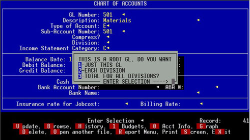
Choosing to graph just the root GL is not meaningful unless you are using the root GL as a regular GL as well.
2-Each Division
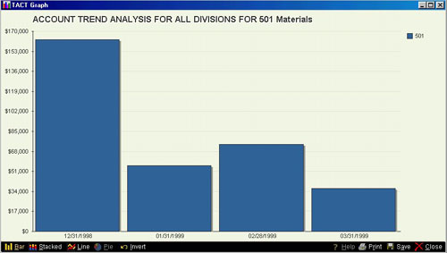
3-Total for All Divisions
If you ask for a graph of a GL that is not a root GL, you will get the following choices:
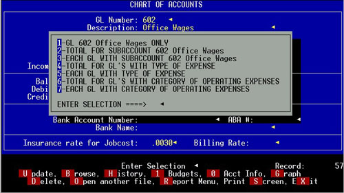
1-GL only
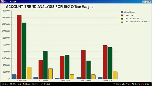
Graphs of expenses will default to graphing the actual income or expense account, the budget amount (if there is one), the total sales, total expenses and total for the type of expense or income. You can eliminate any of these values, as needed.
The graph also shows the average for each of the categories shown.
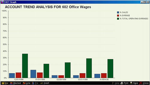
When you choose to graph an income or expense account, you get the option of graphing the amounts or graphing the values as a percentage of sales, expenses and type of expense or income.
2-Total of all accounts with this Subaccount will show you a bar for the total of all accounts with the same Subaccount as this one. See Assets for an example.
3-Each account with this Subaccount will show you one bar for each account that has the same Subaccount as this one. See Assets for an example.
4-Total GL’s with the same Type will show one bar for the total of all accounts with this same type. See Assets for an example.
5-Each GL with the same Type will show one bar for each GL that has the same Type as this one. See Assets for an example.
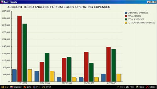
6-Total of GL’s with this Category will show one bar for the total of all GL’s that have the same Category as this one.
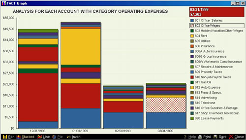
7-Each GL with the same Category defaults to a stacked bar to show you each GL as part of the total for that category.
GRAPHING FINANCIAL STATEMENT INFORMATION
You can graph comparative income statement and balance sheet information simply by printing or viewing the report you want and then answering Y when asked if you want a graph also.
This is a sample of a Comparative Income Statement for a 12-month period with some of the months removed for clarity.
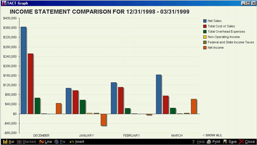
This graph shows the major totals on the Comparative Income Statement. You can remove any of the categories you like to customize this graph.
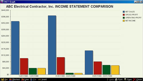
This is an example of a Comparative Income Statement for 3 prior periods.
This is an example of a Comparative Balance sheet for a 12 month period with some months removed for clarity.
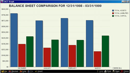
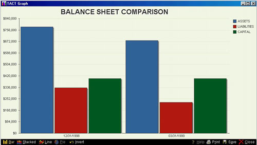
This is an example of a Comparative Balance Sheet as of 2 prior periods. Total Assets, Liabilities and Capital are shown.
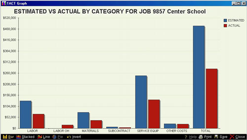
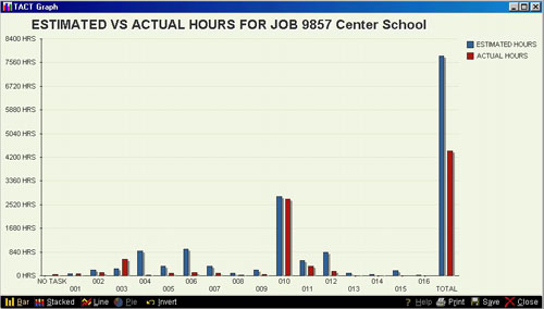
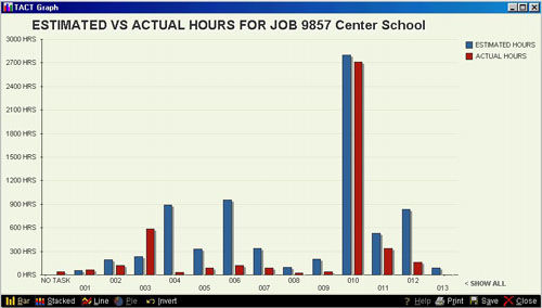
GRAPHING JOBCOST INFORMATION
To graph information about one job, go to that job in Add/Change Job Info and select G for Graph when looking at that job.
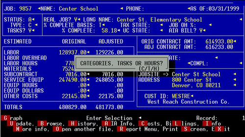
You are given a choice of graphing by categories, tasks or hours.
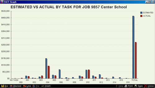
These two graphs are of the same data. The graph below has been inverted and the estimated values have been removed along with the total to make the graph more readable.
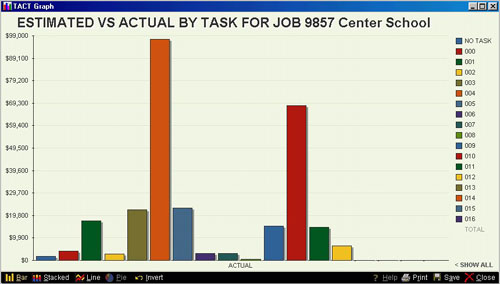
The graph below is the same as above with the total removed and each task that had no actual hours removed for clarity.
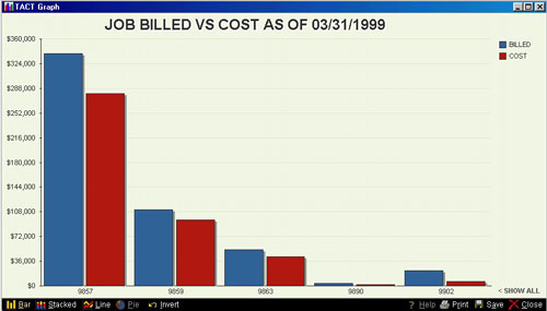
GRAPHING MORE THAN 1 JOB
You can graph Billed vs Cost for any selection of jobs using the Job Profitability Report and then saying Y to the Graph question.
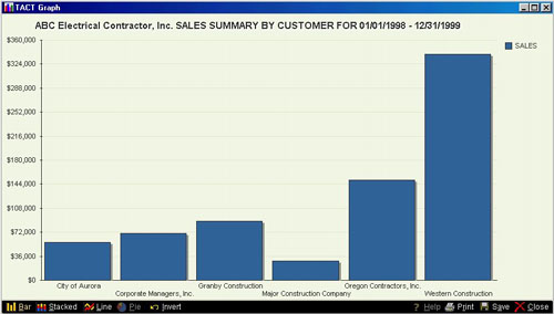
GRAPHING SALES AND CUSTOMER INFORMATION
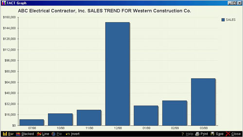
You can graph the sales trend for any customer by going to that customer record and choosing G for Graph. You will be prompted for a range of dates. The default is the oldest to the latest date.
You can also compare sales for any group of customers by selecting the Customer Summary Report and then answering Y to graph. It is best that you enter a minimum amount of sales when prompted so that you don’t get your smallest customers on the same graph as your largest customers.
GRAPHING PURCHASE AND VENDOR INFORMATION
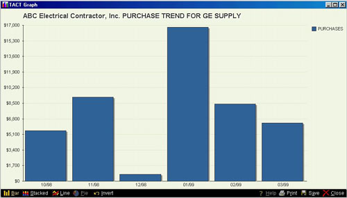
You can graph the purchase trend for any vendor by going to that vendor record and choosing G for Graph. You will be prompted for a range of dates. The default is the oldest to the latest date.
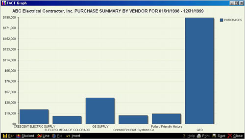
You can also compare purchases for any group of vendors by selecting the Payables Summary Report by Vendor and then answering Y to graph. It is best that you enter a minimum amount of sales when prompted so that you don’t get your smallest customers on the same graph as your largest customers.
|
|
|  |  |  |  |
|
|
